Statistics
Introduction to Statistics
Statistics, or statistical procedures, refer to a set of mathematical procedures to organise, summarise and interpret data[1]. Being able to analyse and interpret statistical data is a key skill for researchers and professionals from many different disciplines. You will need to make decisions based on statistical data, to interpret statistical data in research articles, and to conduct your own research and interpret its data
Explore basic statistical concepts that underlie statistical analyses, such as types of measurement of data, and useful definitions related to samples and population.
Two families of statistics will also be discussed: Descriptive and Inferential
You will learn about the graphic representations of data: histograms, pie charts and line charts
The study of statistics involves the following skills and knowledge:
- statistical concepts and necessary maths formulae
- different types of statistical analysis and their purpose
- ability to interpret and read results from statistical analyses
- making decisions about statistical results
[1] The word ‘data’ is from Latin and is plural, ‘datum’ is the singular. However, ‘data’ as a singular noun is widely accepted in some disciplines these days.
Activity 1: Interpreting and analysing statistical data
Basic concepts in statistics
Descriptive and inferential statistics
There are two types of families of statistics:
Descriptive statistics
Descriptive statistics are used to summarise and describe data (information that has been collected).
- Data are usually organised and presented in tables or graphs that summarise information, such as histograms, pie charts, bars or scatterplots.
- Descriptive statistics are only descriptive and, thus, do not involve generalising beyond the data that has been collected.
Examples of descriptive statistics are the average age of university students, or the number of female and male students undertaking a Health Sciences degree.
Inferential statistics:
With Inferential statistics, data are usually collected from a sample; that is, a smaller representative subset of the larger population we wish to investigate.
- Inferential statistics use the theory of probability to investigate whether patterns found in the sample of study can be generalised to the wider population where the sample comes from.
- Inferential statistics aim to test hypotheses and explore relationships between variables, and can be used to make predictions about the population.
- Inferential statistics are used to draw conclusions and inferences; that is, to make valid generalisations from samples.
Examples of inferential statistics are statistical techniques to explore the relationship between variables (e.g. correlation coefficients). These techniques show us whether two variables are related: for instance, whether there is a relationship between stress levels and academic results.

Activity 2. Descriptive and inferential statistics
Useful statistical concepts
-
Population and sample: These are sets of individuals in a study, and are representative of the entire group that you wish to study (e.g. all Australian university students). Because accessing the whole population is rarely possible, data is usually collected from a sample or set of the relevant population.
-
Sampling error: Even though samples should be representative of the population, in some cases sampling errors may have a negative impact. For example, a sample may over represent certain individuals by having a particular characteristic (e.g. more students who are highly stressed might choose to volunteer for a study on stress at university, than students who are not stressed). Sample size, or the number of participants/observations, will also affect the results of inferential statistics.
-
Data: Measurements or observations collected from a sample or population.
-
Statistic: Characteristics of the sample under study (e.g. mean or average study time of La Trobe university students).
-
Parameter: Characteristics of a population (e.g. mean or average study time of university students).
-
Variable: A property or characteristic of a person, event or object that can take on different values or amounts (e.g. study time). Variables can be grouped into two categories: independent and dependent variables.
-
Independent variable: A variable that is manipulated in order to investigate its effect on another variable.
-
Dependent variable: A variable that is affected by the independent variable.
-
Controlled variables: These are the variables that you keep constant (controlled) during the experiment or research study.
For example, if we want to determine what type of antidepressant (drug A, drug B or drug C) is most effective in the treatment of depression:
- The independent variable is the type of antidepressant, as the researcher is interested in analysing what treatment is most effective.
- The dependent variable is the level of depression; the researcher will measure whether levels of depression change as a result of administering drug A, B or C ; that is, the research study will determine which drug is most effective.
Another example: If we want to investigate whether students who listen to music when they study obtain higher grades than those who do not:
- Independent variable: listening to music (yes/no)
- Dependent variable: academic grades which may be influenced by the independent variable (listening to music or not ).
Activity 3. Dependent and independent variables
Levels of measurement
Understanding your data is important as it determines the level of measurement. There are four levels of measurement of data: nominal, ordinal, interval, and ratio.
-
Nominal variables express a qualitative (either/or) attribute and do not imply a numerical ordering. These variables are known as categorical or nominal. Examples of this type of variable are gender (male/female), or marital status (married, single, divorced,…).
-
Ordinal variables express categories with a natural order; that is, values that can be ranked. However, the precise difference or distance between categories is unknown. Examples of ordinal variables are:
- Educational level, which can be ranked (e.g. from primary education to postgraduate research,
- The rate of agreement or disagreement with a statement or question.
Thus, individuals can be ranked according to the importance they give to religion, but the precise difference between two responses (e.g. very important and important) cannot be defined.
- Interval variables express numerical data that can be measured along a continuum, and the distance between numerical values is equal. However, there is no absolute zero. For example:
- IQ (a measurement of intelligence) can be measured numerically along a scale, and the distance between an individual who scores 100 and an individual who scores 105 is the same as the distance between 105 and 110. There is no absolute zero as an individual cannot obtain a score of 0.
- Ratio variables are similar to interval variables, but with an added characteristic: a zero measurement is an absolute zero. For instance:
- Income can be classified as a ratio variable because income can be distributed along a continuum fromlow to high. A zero score exists as a person’s income can be $0.00.
The diagram below shows the differences between each type of measurement.
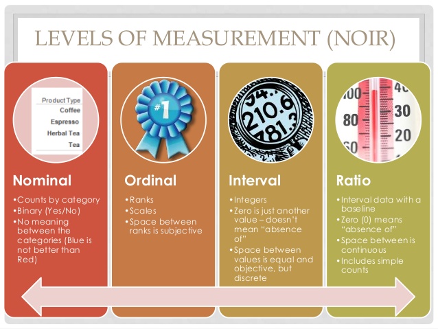
Retrieved from http://www.slideshare.net/KarenHarker1/inferential-statistics-34291836
Activity 4. Identify level of measurement
Graphic representations
Statistical information is usually presented and summarised using graphics and tables. The type of graph used to summarise and present data will depend on the level of measurement of the data:
- Nominal data (i.e., qualitative attributes) are often represented in a pie chart or bar chart. With this type of data we are interested in presenting the frequency of responses for each category.
Pie charts
In a pie chart, each category is represented by a slice of the pie. The area of the slice represents the percentage of responses in the category.
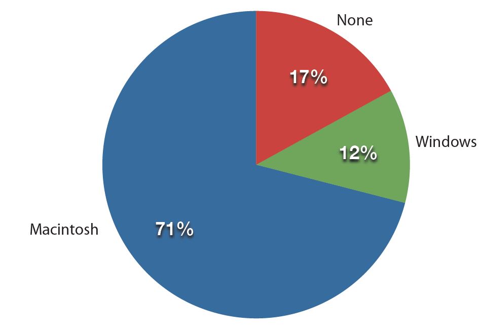
Fig 1. Frequencies of previous computer ownership by current Mac users (Retrieved from http://www.onlinestatbook.com/Online_Statistics_Education.pdf)
Pie charts are particularly helpful when displaying frequencies of a small number of categories. But they can be confusing if there are a large number of categories, or data from two different studies or experiments are presented.
Bar charts
Bar charts display the frequencies of different categories. Bar charts can also be used to compare the responses of two or more groups. In the example below, the bar chart compares the perceived stress of males and females by marital status (e.g. single, divorced, separated,…).
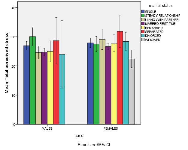
This bar chart allows us to compare perceived stress by gender and perceived stress. The X axis shows two groups: males and females; whilst the Y axis represents their scores on perceived stress. The higher the bar, the higher their perceived stress.
Moreover, each bar represents a group of males or females by marital status (the legend of the bar on the right shows what colour is used for each group). A quick look tells us that the separated women are the most stressed group, and widowed women perceive less stress than any other group.
However, it is important to note that we can’t conclude that widowed women in general are less stressed, or that separated women in general will be more stressed than any other group. This is an example of descriptive statistics: the graph summarises perceived stress by gender and marital status. To investigate whether there is a significant difference between these groups- and whether we can generalise these results to the wider population- we will need to employ inferential statistics.
- Numerical data (ratio and interval) is usually represented by means of a histogram. A histogram is a frequency bar chart that shows the distribution of scores, and gives information about the shape and distribution of scores. Histograms are often used to assess the normality of distribution of scores, which will be discussed later.
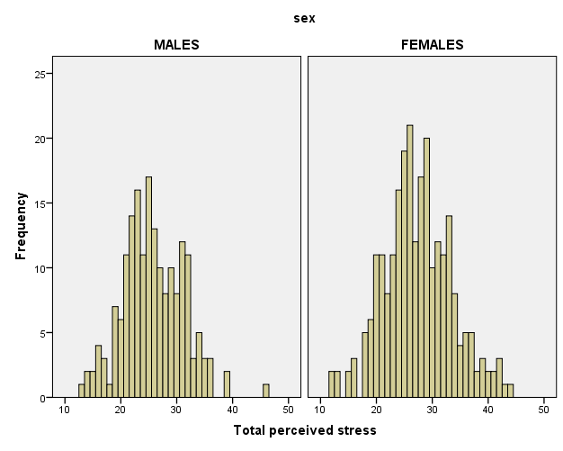
Fig 3. Example of histograms. Adapted from Pallant, J. (2013). SPSS survival manual: A step by step guide to data analysis using IBM SPSS (5th ed.). Sydney, Melbourne, Auckland, London: Allen & Unwin
The x axis represents scores on perceived stress (e.g. a person can score 30, 35, 40,…). The y axis represents the frequency of each score; that is, how many times each score occurs. For instance, a score of 20 has a frequency of 10 for females; that is, 10 females scored 20 on perceived stress. Each histogram represents the frequency of stress scores for males and females and allows you to compare which scores are most frequent for each group.
Again, this only gives you descriptive information about your groups, but does not allow you to conclude that females are significantly more stressed than males, for instance.
Further resources
The Khan Academy has produced a series of videos that explain diverse statistical concepts.
The RMIT Learning Lab contains fact sheets on statistical concepts, including useful statistical definitions.